

Advertising Agency: New Moment New Ideas Company Y&R, Belgrade, Serbia
Creative Director: Dragan Sakan
Copywriter / Art Director: Slavisa Savic

There are many fundamental steps to consider when developing animated text for a music video.
The aim of the text is to enhance the video through the use of visually attractive graphics and exciting elements. Such effects don’t have to be complex to be appealing; add visually exciting text and effects, a fun concept in time with the music, a fast pace, and you can succeed.
The animated text and effects will be developed to a fictional music loop that I have created. This project will take you through a step-by-step process on how to create a simple, yet visually appealing text that will enhance the music video. The steps will use After Effects and will cover tips on file set-up, animation, sequencing and design.
Click here to download the support files (18.4MB)

Click here to download the tutorial for free
related links:

Summary Make no mistake: Detective Max Payne is one tough mother. That’s especially true when he’s angry. And somebody has made him very, very angry indeed. Such is the cursory premise of director John Moore’s Max Payne, a big screen, live action version of the popular video game starring brawny actor Mark Wahlberg in the title role. When you throw in a mercenary and corrupt pharmaceutical company; a hallucinogenic, hyperaddictive drug; and hordes of truly gnarly flying demons and…well, you know things are going to get complicated.
Toronto-based Spin VFX knew from the outset that Max Payne would be a complex project, and they went at it with gusto. Harnessing their design, animation, and modeling expertise, not to mention their prowess with several Autodesk Media & Entertainment products, the Spin team helped transform the dark premise into a stylish, sleek, and bravely brooding piece of graphic novel-style art.
Spin Visual Effects Supervisor Jeff Campbell, Senior Effects Artist Tim Sibley, Rigging Supervisor Glen Chang, and Modeling Supervisor Erin Nickolson sat down with Autodesk to talk about the challenges and triumphs of the films.The Setup Spin’s initial introduction to Max Payne came when Everett Burrell, the film’s production supervisor approached the company – and ten others – with a series of HD plates: “The plates were preliminary shots for a huge and terrifying drug sequence,” says Campbell. “Everett basically gave them to eleven different companies and let us go at it. I actually used Inferno as a tool for design and experimentation for our pitch. I love the system’s interactivity, and it enabled us to bring in entire sequences, try effects, and find out immediately what was working and what wasn’t. In the end, they liked our look best, and we won the job.”

The pivotal scene in question here sees Detective Payne emerging from the icy waters of what looks like New York’s Hudson River, where he has come close to drowning after eluding two men who want him dead. His body temperature plummeting, Payne realizes he must ingest two vials of Valkyr, an illicit drug that makes its users feel superhuman before dropping them into hopeless addiction, if he is to wreak his vengeance on the men who murdered his wife and infant son. read more..
related links:
www.spinpro.com
www.autodesk.com


Why am I up at 1:30am scouring the internet for packaging design? I have no clue, but I did come across an unexpected surprise via our friends at NotCot: Villianess Soaps.
From NotCot:
"Villainess Soaps just popped up on NotCouture ~ and while at first i simply crossposted it to .org… i quickly realized there was too much awesomeness to show in one 250x250 image… so here’s a proper post on their incredible packaging! Granted i have no idea how their products are… but they’ve won me over with their vintage pirate like feel… its like the Lush i’d imagine pirates/wenches would use! With hilarious naming, great graphic design, and an incredible clawfoot bathtub display at the Den of Antiquities… you have to take a peek!"
Read the whole NotCot article here.


related links:

One of the easiest ways to make a boring space more vibrant is to use colour. However, as so many of us can remember, obvious opportunities to do this have been missed for decades in schools, universities and hundreds of other places where young people are more or less stuck for long periods. Luckily, today’s kids have better luck — at least in the schools where Amsterdam’s i29 has had its say.
i29 Interior Architects consists of two interior designers — Jaspar Jansen and Jeroen Dellensen — and is known for clear, bold solutions. A good example of this is their custom furniture project for a Het Veer. It is a public school in Almere, a city located 25 kilometers east of Amsterdam and often referred to as the most modern city in Europe. Het Veer is a school for children with learning and concentration difficulties and the objective of i29’s work was to express and entice concentration, playfulness and movement. Their eight different white and red tube furniture pieces can be mixed and matched creating various formations. They play off the Buzz Wire science game that teaches about electric circuits and is based on concentration and hand coordination.
At the Caland Lyseum in Amsterdam, 1,500 students work in a sport-centric environment where they receive coaching for their specific sport and in academic topics. i29 was asked to envision the public spaces — including the main hall, staff room, library and computer/media room — for the new Bos & Partners architects-designed building with its gray brick, glass walls and unusual floor plans. They used large images of the school’s famous sports hero alumni and then custom-created multi-functional tables, benches and signage, plus a color scheme for the common areas. The award-winning solution matches the dynamic and multicultural life of the school yet lets the buildings features dominate. - Tuija Seipell
related links :
www.i29.nl

Shoes say as much about the wearer and his or her character as do eyeglasses. Jamie Hayon’s line of shoes for Camper is perfect for self expression. With his industrial design aesthetic and love of tap dancing shoes, Hayon has created a collection of sporty shoes that has a touch of elegance; an upgrade from the humble sneaker. With its smooth, form-fitting shape, linen-print lining and diamond-patterned sole, this shoe is more than just a mere accessory for the feet – it’s a fusion of style, form and function. – Kate Vandermeer


Related links:
www.purecollection.com

Brand revolution – Delivering award-winning design for one of the world’s leading beauty companies.
Challenge
To build the big buzz necessary to grab national retail placement for Alberto Culver’s new line of natural facial care products.
Insight
Alberto Culver knew they had to respond to consumer trends and a category shift towards natural and organic skincare. Based on consumer research, our response targeted the natural sensations associated with key product formulations, and the sensory benefits that created the kind of emotional response that demands trial and maintains brand loyalty. This culminated in impactful positioning around the concept of natural science.
Solution
Kaleidoscope knew that this line, under the St. Ives brand and with an elevated price point, needed a powerful name and a compelling package design to really win at shelf. Through collaborative interaction with the Alberto Culver team – we delivered.
It began with the name Elements. And from this initial inspiration we redeveloped a St. Ives-focused design strategy. The smart use of white space, in combination with organic visual cues, delivered a design that successfully communicated exactly what the product inside would deliver – skincare with naturally fresh and clean results. This gave Elements a unique retail presence, with the power to gain display and incent consumers to purchase.
Result
The Elements line and its design refreshed the St. Ives equity, without losing the personality of this long-standing brand. It also created media buzz which garnered the attention of the beauty press. Consumer response was extremely positive, sales projections were exceptional, and retailer reviews – excellent!

I came across these bottles of Embodi at my local Whole Foods store. The idea here is to jump on the antioxidant bandwagon and provide all the benefits of red wine without the alcohol. I couldn't locate the firm that did the packaging. The bottles are resealable and made from aluminum (to protect the antioxidants from elements that destroy them). They are fairly small bottles, holding about 8 ounces. The photographs don't entirely do the package justice; the bottle actually has a really nice, luxe pearlescent sheen to it. Due to the odd size and bold graphics, these bottles immediately stood out on the shelves. The one thing that keeps bothering me is the section of "b" in the logo that's encroached upon by a cutaway leaf. From a distance it looks like a printing error.
Designed by Chicago based Kaleidoscope.
Related links:www.drinkembodi.com
www.thinkkaleidoscope.com


Packaging for Cricket Cola, a green tea cola, designed by The Powell Rogers Project.
Related links:
www.thepowellrogersproject.com

Over the next two years, McDonald’s will roll out its newly designed packaging to nearly 14,000 of its restaurants in the US, and then to another 117 countries worldwide. Birmingham UK based design studio Boxer Creative was commissioned by McDonald's to undertake this massive makeover. According to Boxer, the goal was to "change the way the world feels about eating McDonald's food":
"The new design engages in an honest conversation about the quality of McDonald's food. We have created a global packaging design system that embraces a consistent framework but alows for customization to create local market relevance. Its bold and simple design celebrates all that's good about McDonald's, shilst reassuring consumers about the origins of the food they are about to eat."
See photos of the rest of the packaging, as well as a history of previous designs after the jump. What do you think? Are you lovin' it? Sorry I had to...


Related links:
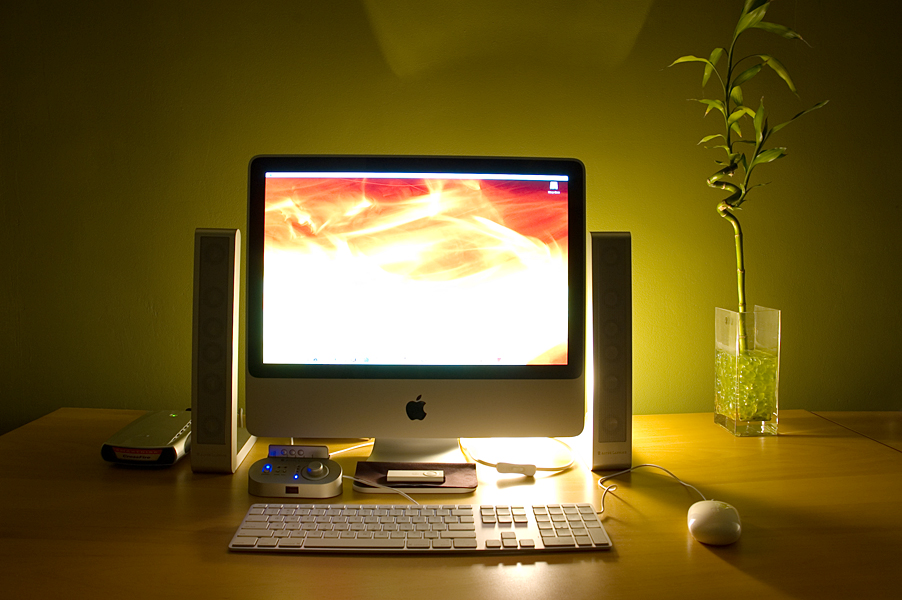

How much time do you spend in your home office each day? 1 hour, 3 hours, 6 hours or more? If you spend a lot of time in your home office then you should consider giving it a total re-design. Having a clean and inspiring environment is essential to being healthy and working to your fullest potential.
I will point out some tips, resourced and show you a bunch of cool home offices to get you started on your office re-design. When you are done with your new office you will never want to leave!
How to get Started
1. Research
Check out other peoples office’s, research colors at the paint store and browse office furniture stores and websites so you can get a solid idea of what you want your office to look like.
2. Take measurements and Start Planning
The last thing you want to do is find a cool piece of furniture and then find out it doesn’t fit. So measure your room to see what kind of space you are working with.
3. Prep Work and Painting
Chances are you will need to do some prep work and this could include tasks such as filling holes, removing wallpaper, adding a primer coat of paint to the walls and so on. Once your room is prepped head over to your local paint store to get your paint, rollers, masking tape, brushes, pans and so on so you can paint! read more..

Advertising Agency: DDB Brazil
Creative Directors: Sérgio Valente, Julio Andery, Rodolfo Sampaio
Art Directors: Julio Andery, Adriano Alarcon
Copywriters: Rodolfo Sampaio, Marcio Fritzen
Illustrator: Seagulls Fly, Sergio Guilherme Filho, Jorge Ribeiro, Vetor Zero, Eliza Flores
Photographer: Alê Catan

Consuming the Earth is consuming our future.
Advertising Agency: Germaine, Antwerp, Belgium
Creative Director: André Plaisier
Art Directors: Alexis Bellavoine, Jeroen Goossens
Copywriter: Pieter Claeys
Photographer: Kurt Stallaert
Retouching: Edwin Veer
Published: October 2008

The truth is no one is perfect and no one will ever be perfect, but life is all about improving yourself and being as productive as possible with the precious time you are given. Work often consume our lives, but if we can become more productive at work and adopt good habits, our personal lives, in theory should improve as well.
This list was created to help inspire you to make the most of your work days, become more involved in your career and be a healthier and more productive designer and person. Feel free to add your own suggestions for being a more productive designer to the list below.
1. Make the most of your commute
If you have a long commute try making the most of your time. Read a book, get a laptop to start work ahead of time or plan out your day.
2. Keep a task list
Keeping a task list will ensure you remember everything you need to do. Organize your task list by importance and cross things out as you accomplish them, but accept the fact your task list will probably never end.
3. Become familiar with Adobe suite keyboard shortcuts
Learning essential keyboards shortcuts for programs such as Photoshop and Illustrator can actually end up saving you many hours in the long run.

With 66 minutes in the main program, 13 minutes of behind-the-scenes extras, 35 minutes of bonus films, 30 minutes of bonus music and free HD stock video clips from YouWorkForThem, Stash 51 is a monster issue packed with almost two hours of jolting inspiration.
| Look inside the book (PDF) |

Watch the trailer (QuickTime)
Related:
www.stashmedia.tv
www.lobo.cx
www.moving-picture.com
www.eightvfx.com

Advertising Agency: Mullen Wenham, USA
Chief Creative Officer: Edward Boches
Executive Creative Director: Mark Wenneker
Creative Directors: Jim Amadeo, Edward Jendrysik
Art Directors: Chris Pinkham, Bo Deng
Copywriter: Sarah Sumner
Photographer: Getty Images
Image Retouching: David Onessimo
Post Production: Mark Danish
To be published: December 2008

Frantic Films Software, the software development arm of VFX studio Frantic Films, wanted to tell the industry that its high-volume point-based particle renderer Krakatoa was used by German post facility Unexpected on a recent commercial campaign for Snickers Russia. The two-spot effort via ad agency BBDO Moscow and Spy Films, Toronto, combines feature film-quality VFX with live-action to tell a story of biomechanical creatures that use Snickers as their energy supply. The first spot "RUGBY," is currently airing throughout Russia, while a second spot, "TAG," breaks in fall 2008. read more
related:
Unexpected
Frantic Films Software

This DVD offers an in-depth overview of the rendering plug-in Brazil 2 for Autodesk's 3d Studio Max. In this title Sebastien covers in detail all the different materials, shaders and texture maps included with this amazing tool from Splutterfish. read more
related:
gnomonworkshop
autodesk 3ds max
brazil render engine

This is a short tutorial on how I made the SICHUAN EARTHQUAKE 2008 picture. Do not that far from all small details are included here. Instead, this tutorial is more of a walkthrough on the overall effects and making of the picture. If you have a fair knowledge of Photoshop though, it shouldn’t be too hard to follow. If you have any questions about anything specific, feel free to ask! Read more...
In Adobe Illustrator, the Blend Tool can help you create impressive color blends. But there is more to it than you might know. This comprehensive guide can help you unlock your creative potential and teaches the features, shortcuts, and in depth methods that the Blend Tool has to offer.

Introduction
If you are using Illustrator for detailed imagery creation, the Blend Tool can be your most important tool. Compared to the Gradient Mesh Tool, the Blend Tool is a Live tool, meaning that you can change its object or shape, its color or position, and the blend will be updated live. You can create blends either with the Blend Tool or the Make Blend command. One thing to remember though, the Blend Tool takes a lot of RAM, so it may slow down your computer.
Exercise File
Below is an screenshot of the Exercise file that accompanies this tutorial, and is available to PLUS Members. Want access to the full Vector Source files read more...
AdvNew Caddy Maxi Life, infinitely bigger.
advertising Agency: Piment DDB
Creative Directors: Axel Roy, Remi Gross
Art Director: Matthieu Chanvrin
Copywriters: Barthelemy Flippo, Emmanuel Zerafa
Photographer: Louis Decamps
Published: April 2008
amazing From how the "bent" lines bent to the stabbing of the exclamation mark (and everything in between). It felt as though, every line was given its own personality with your typography..............

Workers are not tools.
Workers are not toolsAdvertising Agency: VVL BBDO, BelgiumCreative Team: Jan Ockerman, Jef Boes
Creative Directors: Jan De Jonghe, Jan Baert
Account Team: Toon De Baere, Philippe Van Eygen
Print Production: Roxane Lemaire
Photographer: Evert Thiry
Published: November 2008{advertising}.......................
Subscribe to:
Posts (Atom)